Getting theme colors in JavaScript using React with DaisyUI and TailwindCSS
Written on
I’ve been building a web app using React and TailwindCSS, with DaisyUI. But while working on it I hit a minor snag: I’m trying to use Chart.js, and Chart.js creates a canvas to render charts. But the canvas can’t pick up the CSS variables that are defined on the page itself. That means that my charts can’t use the colors from my theme, unless I manually copy and paste the theme colors! This is pretty bad for maintainability because if the theme colors are ever changed, or themes are added or removed, you’ll have to come back and update the colors for the charts as well. Boo!
Luckily, I found out that you can read CSS variables from JavaScript. So I added this code:
function getPropertyValue(name: string) {
	return getComputedStyle(document.body).getPropertyValue(name);
}
This returns the value of any CSS variable you pass it. For example
getPropertyValue("--tab-border") returns 1px for my theme!
Next, I just looked through the CSS on the page to figure out what CSS variables DaisyUI sets for themes. I quickly found the most important ones I needed: the primary and secondary colors, and the colors for the text that goes on top of them.
const primary = getPropertyValue('--p');
const secondary = getPropertyValue('--s');
const primaryText = getPropertyValue('--pc');
const secondaryText = getPropertyValue('--sc');
This is all great! But I had one more concern: I needed a way to change these variables and re-render components whenever the user toggles between the light and dark themes.
I decided to use SWR for this. SWR is mainly meant to be used to fetch data from
an API, but there’s really nothing stopping you from using it for anything else.
In this case, SWR will cache all the colors in a primary place, and allow me to
re-render all the components when the colors change using its mutate API.
Here’s how that code looks like:
export function useThemeColor() {
	const themeFetcher = useCallback(() => {
		const primary = getPropertyValue('--p');
		const primaryText = getPropertyValue('--pc');
		const secondary = getPropertyValue('--s');
		const secondaryText = getPropertyValue('--sc');
		return { primary, primaryText, secondary, secondaryText };
	}, []);

	// The key "data:theme" could be anything, as long as it's unique in the app
	const { data: color, mutate } = useSWR('data:theme', themeFetcher);

	return { ...color, mutate };
}
It’s very easy to use it.
export default function Dashboard() {
const { primary, primaryContent } = useThemeColor();
// ... fetch the data and labels ...
return (
<Line
data={{
labels,
datasets: [
{
data,
// borderColor is the color of the line
borderColor: `hsl(${primary})`,
// backgroundColor is the color of the dots
backgroundColor: `hsl(${primaryContent})`,
},
],
}}
/>
);
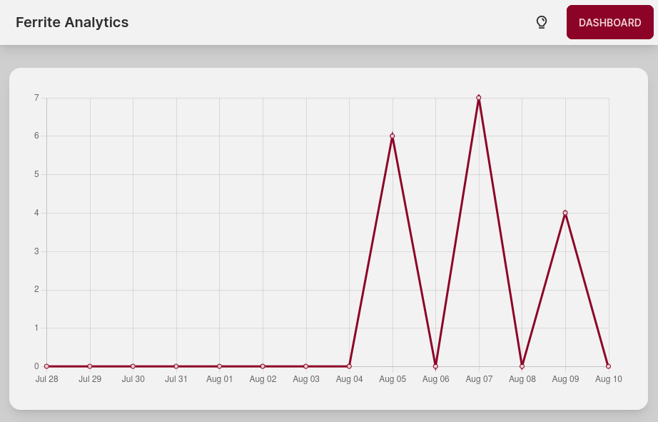
}Here’s what that looks like:
To keep the colors changing whenever the user toggles the theme, you then just
have to call the mutate function inside your toggle button.
export function ThemeToggle() {
  const { mutate: mutateTheme } = useThemeColor();
  const [theme, setTheme] = useState("light");
  const toggleTheme = useCallback(() => {
    if (theme === "dark") {
      document.body.dataset.theme = "autumn";
      setTheme("light");
    } else {
      document.body.dataset.theme = "forest";
      setTheme("dark");
    }
    mutateTheme();
  }, [theme, mutateTheme, setTheme]);

  return (
    <div className="btn btn-ghost text-xl" onClick={toggleTheme}>
      <PiLightbulbBold />
    </div>
  );
}
Oh and that’s a bonus trick for you. You can swap the DaisyUI theme by just
setting document.body.dataset.theme, as long as that theme is enabled in the
settings.